


.jpg)
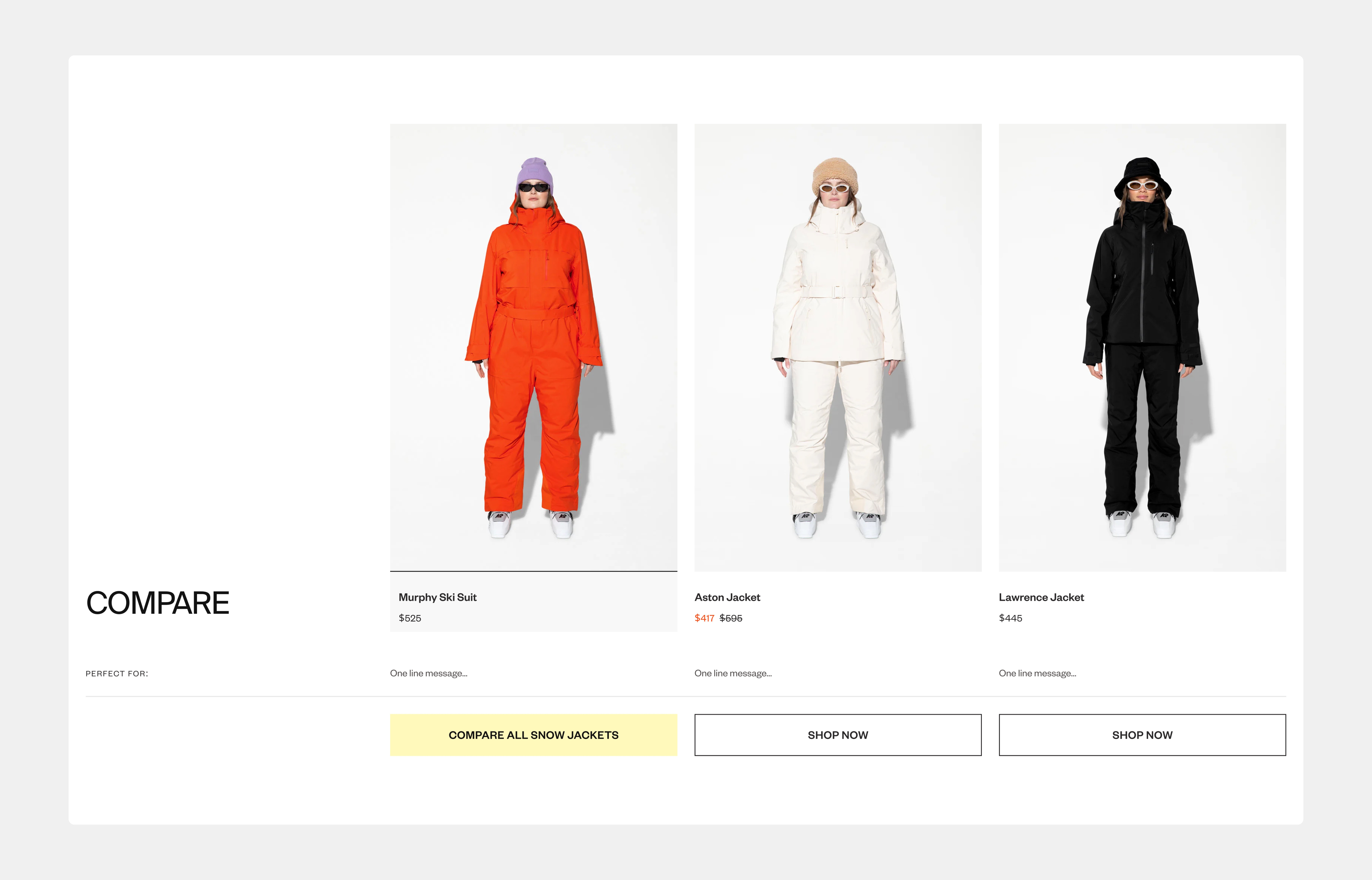
Traditionally, skiers and snowboarders have made buying decisions by walking into a store, pulling two jackets off the same rack, and feeling the differences: weight, warmth, fit, and material.
The Halfdays product comparison tool is a digital translation of that moment, bringing side-by-side clarity to the digital storefront. It’s tapping into some of the biggest shifts in consumer behavior across shopping and media.
The Decision-Making Gap in Ecommerce
Online shoppers, especially in technical or high-consideration categories, face a decision gap:
- Too many choices: CLPs often show 12–48 products in a category grid with little differentiation.
- Too little context: PDPs are islands of information; switching between them breaks flow and forces memory recall.
- Too much friction: Without persistent side-by-side comparison, shoppers rely on opening multiple tabs or screenshots.
From an ecommerce best practice standpoint, solving this gap means making decision enablement a first-class UX priority, right alongside discoverability and checkout speed.
Why the Halfdays Approach Works
The Halfdays Product Comparison is a design feature built on four best-practice pillars:
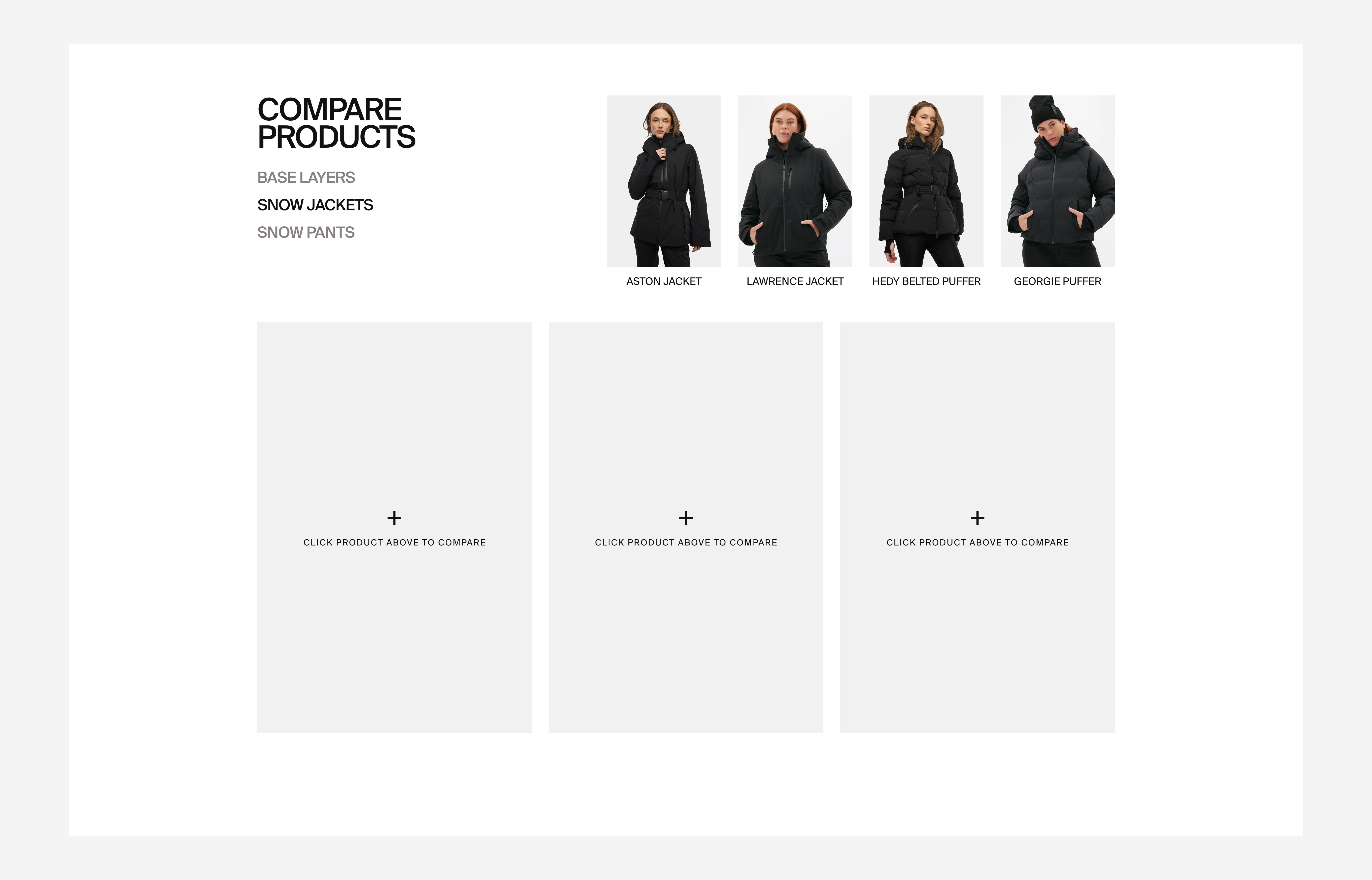
- Persistent Access Across the Journey
- Comparison entry points live on CLP hover, PDP modules, and a dedicated Compare page.
- A sticky bottom tray ensures the feature is never “out of sight, out of mind.”
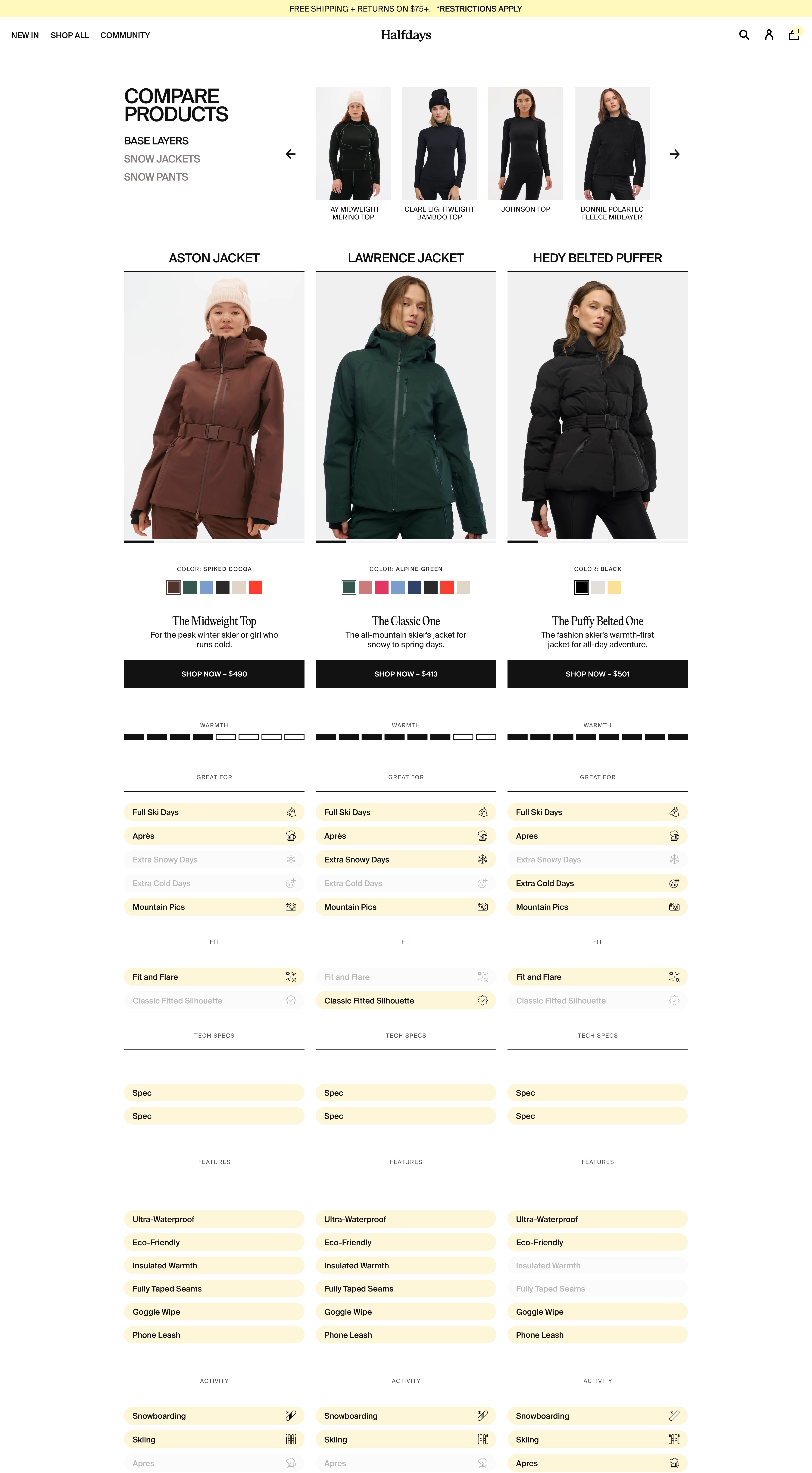
- Contextual Clarity at a Glance
- Warmth scales, activity tags, and feature chips make differences instantly visible reducing cognitive load.
- Color swatch interactivity ensures visual preference is considered alongside performance specs.
- Modular Architecture for Scalability
- The comparison framework can expand to other categories and evolve with new product lines.
- Consistent component structure builds shopper familiarity and trust over time.
- Frictionless Mobile Experience
- Sticky headers and compact card layouts keep comparisons usable in a one-handed, on-the-go context.
Aligning with Today’s Buyers
Today’s ecommerce customers, especially Millennials and Gen Z, bring a curator mindset to shopping:
- They want to assemble their own shortlist before committing.
- They trust visual, bite-sized data over long-form spec sheets.
- They expect interactivity, not static catalog pages.
The Halfdays Comparison Tool delivers on these expectations by turning product selection into an active, exploratory process rather than a passive scroll:
- From Netflix: The “browse → shortlist → deep dive” behavior mirrors how users add movies to their watchlist before deciding what to watch. Persistent comparison trays function like a watchlist you can act on at any time.
- From Social Media: The swipeable carousels, sticky elements, and interactive chips borrow directly from mobile-first interaction patterns. Shoppers aren’t asked to learn a new way to browse—they’re meeting familiar patterns from Instagram Stories, TikTok, and Pinterest.
- From Review Culture: Shoppers increasingly want evidence before making decisions. A side-by-side interface becomes a credibility tool, making features and specs look more trustworthy than claims in isolation.
Commerce+ Alignment: Turning UX Into a Growth Engine
Within the Commerce+ ecosystem, this build is a textbook example of high-impact feature strategy:
- Optimized Storefront System: Eliminates friction points in discovery and evaluation, validated through competitor UX benchmarking.
- Growth Feature Launch Pack: Prioritizes a feature proven in other industries, custom-fitted to the Halfdays brand and category.
- Merchandising Performance Engine: Leverages structured, enriched product data (warmth, activity, features) to fuel both front-end clarity and back-end consistency.
Ecommerce Best Practice Takeaways for the Industry
Even if you’re not selling ski jackets, there are principles here every brand can borrow:
- Meet the shopper where they are in the journey, don’t force a PDP click to start a comparison.
- Visualize differences, don’t just describe them - icons, bars, and chips trump paragraphs.
- Comparison trays, sticky headers, and mobile-safe layouts keep decisions top of mind.
- Designing modular components and scalable data structures let you extend the feature without costly rebuilds, allowing you to future proof your site.
Additional Features to build on top of Product Comparison
The architecture of this tool makes it ripe for future innovation:
- AI-Driven Suggestions: Pre-fill the comparison tray based on browsing or purchase history.
- Bundle Insights: Suggest matching pants or base layers once a jacket makes the shortlist.
- Retention Hooks: Integrate loyalty program messaging to incentivize purchase decisions.
Closing Thought
In a market where every jacket promises warmth, fit, and style, the brand that wins is the one that helps customers prove it to themselves before they buy.
Halfdays’ Comparison Tool doesn’t just bridge the gap between browsing and buying, it turns that gap into an experience in itself.